 By Danny DeCota
Every dental flyer seems to follow the same script. Blue background, stock photo smile, a list of services nobody reads past the first line. It works, technically, in the sense that it gets printed and hung up somewhere, but it rarely gets remembered. If you want people to actually stop and look, the flyer needs a little personality, something that feels less like a brochure and more like a business that people would enjoy visiting. Here are a few strategies to help your next dental flyer actually do its job.
What makes a dental flyer genuinely eye-catching?
1. Open with a hook that is witty instead of clinical
Most dental flyers open with something like “Your smile deserves the best care.” Nobody stops reading because of that line, mostly because they have read it fifty times before. Try something with a bit of personality instead, a small joke about flossing, a line that pokes fun at how much people avoid the dentist, anything that sounds like it was written by a person rather than a template. PosterMyWall’s AI Writer is useful here if writing jokes on demand is not exactly your strength, since you can describe the tone you want and work from what it gives you rather than a blank line.
2. Add a QR code that leads somewhere worth scanning
A QR code that just links to your homepage is a missed opportunity. Link it to something specific instead, a booking form pre-filled for a particular offer, a short video tour of the clinic, or a page with a one time discount code. People scan things when there is a clear reason to, not just because the code exists on the page.
3. Feature a real patient in their own words
A five star rating graphic is fine, but an actual sentence from a patient, even something small and specific like “they got my kid to actually enjoy going,” does more work than a generic testimonial ever will. If you have reviews sitting on Google, pull one that sounds like an actual person said it, not a marketing line, and give it space on the flyer instead of squeezing it into a corner.
4. Cut your team photo loose from its background
A staff photo with a plain white or gradient background can look surprisingly sterile once it is printed. Running the photo through the AI Background remover offered by PosterMyWall lets you drop your team onto a color or pattern that actually matches your brand instead of whatever wall happened to be behind them when the photo was taken. It is a small change but it makes the whole flyer feel more designed and less like a snapshot.
5. Break the blue and white habit
Almost every dental flyer defaults to blue and white because it reads as clean and clinical. That also means most of them blend together. A muted terracotta, a soft sage green, even a warm mustard accent can make a flyer stand out on a board covered in identical blue rectangles, as long as it still feels calm rather than chaotic. If you are not sure where to start, browsing PosterMyWall’s dental poster templates is a quick way to see color combinations that already look put together, which you can then adjust to fit your own brand.
6. Use real urgency instead of a vague deadline
“Limited time offer” means nothing anymore, people have seen it attached to things that were available for months. A specific detail works better.
- “Only 12 new patient slots this month”
- “Offer ends the last Friday of the month”
- “First 20 people to mention this flyer get a free consult”
Specific numbers and dates read as more believable than vague urgency, even if the underlying offer is the same.
7. Add one small illustrated detail instead of another stock photo
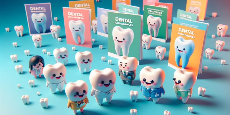
A single custom illustration, a tooth wearing sunglasses, a tiny toothbrush icon doing something slightly silly, tends to catch attention faster than one more photo of a generic smiling family. It does not need to carry the whole design, just enough personality to make someone pause for a second longer than they normally would.
Conclusion
None of these have to be used all at once, and honestly a flyer trying to do all seven at the same time would probably look cluttered instead of clever. Pick one or two that actually fit your clinic’s personality and lean into those. A dental flyer does not need to be a comedy show, it just needs enough personality that it does not disappear into the pile of flyers that all look the same.
FAQs
1. Do I need design software to make a creative dental flyer?
Not really. Most of these ideas, from color changes to background swaps, can be done with a simple drag and drop editor rather than professional design tools.
2. How do I make my staff photo look more polished on a flyer?
AI Background remover can cleanly cut your team out of an existing photo so you can place them against a background that matches your clinic’s colors.
3. What should a QR code on a dental flyer actually link to?
Something specific works best, like a pre-filled booking form or a page with a one time offer, rather than a generic homepage link.